Using ITAP

Example 1: From the lecture on image and text I learnt about how context and meaning can be created or changed when adding text into an image.

I added text to this image to create more meaning as I felt it reflected the theme of street art and added a stronger message through the words.

Principle 2: “Draw by hand” I incorporated this into my RVJ as I felt it was important to communicate on the page and after the lecture learnt that drawing along the way helped to visualise ideas as you create them.

Principle 3- Also in the graphics lecture, I chose to look at legibility. The lecture mainly focused on how to insure your text was legible and notes on sizes and that you must thing of where the piece would be and who needs to be able to see it from what distance? However I particularly liked David Carson from the lecture and how he pushed the boundaries on legibility. It particularly fit into the theme of our magazine and helped us build a brand at the early stages. Above is an example in my RVJ.

ITAP 9- Image & Text

Adding words and text can completely change the context and meaning of the piece. It can add context, or completely change it. It can contradict or compliment the imagery.

René Magritte 1898-1967

Was a Belgian Surrealist painter. Born at Lessines and studied at the Académie des Beaux-Arts in Brussels 1916-18. Made his living by designing wallpaper and drawing fashion advertisements. He also became friends poets and writers such as Mesens, Goemans, Scutenaire and Nougé, who shared his interest in evoking mystery and were later the founders of the Belgian Surrealist group. He was turned away from his early Cubist-Futurist experiments in 1925 under the influence of de Chirico; began to explore ways of creating a poetic, disturbing effect by depicting recognisable objects in alien settings, by startling juxtapositions or combinations of objects, by inversions of scale and so on. First one-man exhibition at the Galerie Le Centaure, Brussels, 1927. Afterwards lived from 1927-30 at Perreux-sur-Marne, a suburb of Paris, where he met Miró, Arp, Tanguy, Dali, Buñuel, Eluard and Breton.

One of his most famous pieces is c’est n’est pas une pipe

This is a statement that the work is not a pipe. It it a canvas with paint on. It is an image and a lie. Below is an example of a contemporary adaption inspired by Magritte, it has been recreated in street art.

I also really like Rob Ryan’s work, he often uses quotes and words in his paper cut illustrations.

His use of words brings out a wit and humour, and often have a sentimental quality which makes his work widely used commercially, especially in greetings cards . Although it does not feel as if the words have just been placed into the art, they truly feel part of the art due to the way he styles them into the image.

I used words in my work in the “Art in a frame piece” due to this ITAP as I felt it gave the illustration a strong sense of meaning and fitted well into the article.

ITAP 13/11/12- Production for Visual Communicators

TASK: When and how was the first book in Europe printed? 

Johannes Gutenberg was the first European to use movable type printing, in around 1430-40

Gutenberg, was originally trained as a goldsmith, went on to create a means of producing metal type in sufficient quantities at a reasonable cost. This involved the design of a type-face and the production of molds used for making the individual pieces of type, as well as the development of an alloy that was soft enough to cast yet hard enough to use for printing.

The first book to be printed with this movable type was the Gutenberg Bible. This is the first book to ever be printed in volume.

Today, only 22 copies are known to exist, of which 7 are on velum. If an entire Gutenberg Bible could be sold on the world market, it would likely fetch an estimated 100 million dollars! Even an individual leaf (a single two-sided page) from the original Gutenberg Bible can fetch around $100,000. Gutenberg’s work is the most rare and valuable printed material in the world.

TASK 2- NOVICE TO EXPERT SCALE

1- Knowledge- I feel I am about 3 on the scale, I have working knowledge that I can often relate back to my work & link together, however still need more knowledge on background history of art and will use this ITAP as inspiration to begin to develop this knowledge.

2. Standard of work- I feel 4 as I have completely a large section of my RVJ thoroughly however can go back to add more annotation & note making.

3. Autonomy- 4- I have helped my group a lot, and feel after my foundation course has helped me to trust my own judgement more. I don’t feel I need close supervision but sometimes need another opinion to check I am on the right path.

4. Coping with complexity- I don’t really understand this as much- I see actions as part of the larger picture but sometimes find myself working backwards

I don’t feel I can put expert on any of the scale yet as there is always more to learn, particularly as a student.

ITAP- 06/11/12 Production and Influence

1- Interpretation 

Zeitgeist

Definition – ‘The Zeitgeist (spirit of the age or spirit of the time) is the intellectual fashion or dominant school of thought which typifies and influences the culture of a period’.

 This defines how artists are influences by what is happening around them at the time, for example what technology is available, politics, major events and the media.
Different interpretations of Wizard of Oz
1900- Illustration from the first edition of the Wizard of Oz- William Wallace Denslow.
The design was lavish for the time, with illustrations on many pages, backgrounds in different colors, and several color plate illustration. The illustrations became as iconic for the book as the story.
1944 illustrations by Evelyn Copelman which were more based around the 1939 film version, more colour is available. The 1939 film was a triumph of it’s time for it’s use of technicolour & special effects- this is how it used the technology available of its time.
This is a policital version influences by the times- 1906- William Randloph Hearst caricatured as Oz character in 1906 magazine cartoon. Cartoonist W. A. Rogers in 1906 sees the political uses of Oz: he depicts William Randolph Hearst as Scarecrow stuck in his own Ooze in Harper’s weekly. This shows how politics at the time influenced the artist to change and transform Wizard of Oz. 
Delivery 
Delivery comes in different forms and defines how you showcase your work, examples are through print such as magazines, online, advertising, galleries.
What is important to delivery is the audience as different platforms can reach different people. Also depending on delivery will change how you create for example typography on  billboards must be large and clearly visible.
On iPad and apps there is more interactively to design with the audience.
Julie Verhoeven is a fashion designer and illustrator who crosses her work over onto different platforms to create these stunning designs.
Upon this I have uploaded some designs to Cafepress & Society 6 to bring my illustrations onto different platforms and help them be seen.

ITAP 6- Narrative & Structure

Principle 1- Three act Structure.

All stories and narrative follow the same structure- A beginning, middle and end-

A equilibrium > disequilibrium > equilibrium. 

This means balance, so that all narrative starts of in a state of balance, what the characters are used to, then something will happen- a point of conflict will disrupt this state of balance in the story, and create a disequalibrium- by the end of the narrative there will once again be a equilibrium.

However what is important is that this equilibrium is never the same as the start, as events have changed and shaped the characters & narrative.

For example- In cinderella the beginning equilibrium is that cinderella is mistreated by her stepmother, the point of conflict if when ball invitations come and she is not allowed to go.

Creating Character

Propp theory-

  1. The villain (struggles against the hero)
  2. The donor (prepares the hero or gives the hero some magical object)
  3. The (magical) helper (helps the hero in the quest)
  4. The princess (person the hero marries, often sought for during the narrative)
  5. Her father (usually dies during or before the film/book)
  6. The dispatcher (character who makes the lack known and sends the hero off)
  7. The hero or victim/seeker hero, reacts to the donor, weds the princess)

A villain often has a flaw- for example the Phantom in the phantom of the opera’s love for Christine Daae is his weakness.

Companies sometimes make a character to create more money, such as “Compare the market” meerkats have been successful in merchandising despite not being associated with marketing.

They have expanded into making toys, adverts, and books from their character to bring attention to the website.

ITAP 5- 23/10/12

Principle 1- Legibility 

leg·i·bil·i·ty noun

1. Also, leg·i·ble·ness. the state or quality of being legible.
2.Also called visibility. Typography . the quality of type thataffects the perceptibility of a wordline, or paragraph ofprinted matter. Compare readability ( def. 2 ) .
Some factors that can effect legibility are- font, size, character shapes, serifs, weight, lining.
Type size needs to be appropriate to be legible, so where the text will be shown is important.
Image
David Carson pushes the boundaries on legibility with his typography, his widely imitated aesthetic defined the so-called “grunge typography” era. He over laps text and builds it up to create different tones and surfaces. He famously made the text in the Ray Gun magazine unreadable.
It is normally of most importance that text for magazines, newspaper & print is legible to the audience so that they can read the articles, however Carson pushed this to the extreme.
I personally really like Carson’s typography as even though it is illegible it creates textures and images in the way it has been put together. I have taken this idea and put it into our magazine as it fits into the style of out magazine.
Tone of Voice- Principle 2
The tone of voice effects how the audience respond, understand and interact with your text/image.
Tone of voice can be the way something is written, or how it is written. For example something in capitals and bold is seen as a bold statement, normally of importance such as on STOP signs or as  the heading of a newspaper.
Things handwritten are often used for a younger audience, such as in Kerri Smith’s books it adds quirky edge to the text. It also feels welcoming and personal to the reader rather than the standard typography.
This website has a very young, bubbly tone of voice as it is aimed at female children. The colours, text, grammar and style all tie together to give it a ‘pop’ young feel which appeals to young girls.

ITAP 4- Research & Inspiration

Aside

Research

Research is the key to problem solving- to research is to gather information and visuals to expand your knowledge and inspiration.

Primary research is collected personally by yourself- I have done this in my project by taking my own photographs and observational drawings. I feel it is important as it puts your own impression on your work from the beginning. I could expand my primary research by collecting information by asking questions.

Visual research can be from drawings, reading, your surroundings. It is important to be in a constant state of enquiry- this has help me open my eyes to the world around me and recently be inspired by a wall of graffiti to turn it into a piece of graphic art.

Paul Davis is constantly taking in his surroundings, he does constant sketches, doodles, photographs and notes as it is important not to just record in one way as others can help you bring something else forward.

Davis research helps bring an insight into how he thinks as we see the development through his work and how he brings his research into his work.

Audience.

The audience of your work is who it is aimed at, nothing is aimed at everyone- the audience can be based around age, gender, and social class.

To connect to your audience is to create something which appeals to a certain group of people, it is important to do this to know your audience will enjoy & appreciate your work.

Once you understand your audience it focuses and enhances the communication as every decision you make must justify the target audience.

This Lancome advert is probably aimed at women aged around 21-35, the model is a well known actress to help sell the product and bring in an audience of women who idolise her, therefore probably a younger audience. The colours indicate a higher social class as the red black and silver are sophisticated colour scheme which links to the higher priced brand. The handwritten typography and hand drawn style heart give it a funner side, which aims it at a younger twenties audience.

Connectivity – ITAP 3

‘Nothing is original’ – Jean Luc Goddard.

Notions of originality. Since nothing is original, I have learnt that is is okay to be inspired by work already available but especially if it is something that inspires your own imagination to take the idea somewhere new.

Consume everything around you. To help this it is important to be constantly aware of things you do, from watching films to television and books. Places you are going, have been, poems, newspapers (this links into cultural context too) books, people, conversations.

Everyone is inspired by something, so bring that to your work. Even the men behind French new wave cinema put underground jazz music in their films they were inspired by- since then director Tarrantino has been influenced in his films by the french new wave films.

I also learnt in this lecture that titles for work are signposts to the context and content, not a description of the piece. It can make the artists meaning clearer, or juxtapose the context to make the audience think.

For example Hirst’s famous diamond skull was titled ‘For the love of God’- an exclamation by his mother on what he was doing, this seems to add even more eccentricity to the piece.

Also in the ‘Origin of War’ by L’Origine de la Guerre, 1989 the piece at first may seem to some vulgar and pornographic however when the title is applied it becomes a cultural statement on our society that men create war.

Taking an idea and changing or manipulating it can create a whole new statement which can be political, social, or personal.

By changing this piece inspired by David by Michael Angelo creates a statement on our ideals and questioning what will be seen as ideal if people continue to overeat.

Be inspired by what is around me, take everything in and give it out in art. Don’t be afraid to be inspired. 

ITAP L4 – 02.10.12 Development of the creative thought & structure in illustration & graphic art.

Restating problems

Visual communication is all about solving problems, as the artist/designer you have to have the confidence to imaginatively solve these problems from different angles and different solutions.

You can create the answer to a visual problem a new interesting way if you defy the conventional rules.

Renewing your approach gives you more options for the final solution. Examples to help you renew the problem are trigger words- which can be found in a book or magazine possibly related to the subject and asking what does this trigger suggest regarding the problem?

I could apply this to my own work by creating lists of initial ideas, then using the ones though about later on as they are not the first safer choices you go too. Also from looking at this piece of work by Yuko Shimizu I could mix media in my own work to create new solutions- crossing different disciplines to create fresh new ideas.

I could cross the images of birmingham i have taken in photos and cross them with the illustrations.

Creative environment

The environment you work in can influence your state of mind and your work.

Build a reservoir of creative materials to help inspire you- postcards, doodles, clippings.
I make small journals with papers and small imagery i keep but to create a creative environment I could display these more so that they aren’t shut away.

Also keep rearranging things so that they don’t just become part of the background and become engaging.

I chose this as an example as they have surrounded themselves with influences on the walls and gave themselves a desk to work at. Also the colours are calming and neutral to help the mind be in a relaxed state.


I also looked at this creative environment as it has a lot of materials near by which is important. Such as having the paintbrushes, and different media available to you in your creative environment. Also there are lots of books and reference material near by to help inspire, and influence new ideas. I also like that it is by a window too as I personally find it easier to work with daylight and outdoors near by.

From this lecture i have been inspired to bring new elements into my work, to take more risks and mix up media. Also to provide myself with a creative environment, surrounded by books and materials to help influence my work.

Principle 1- Dr…

Aside

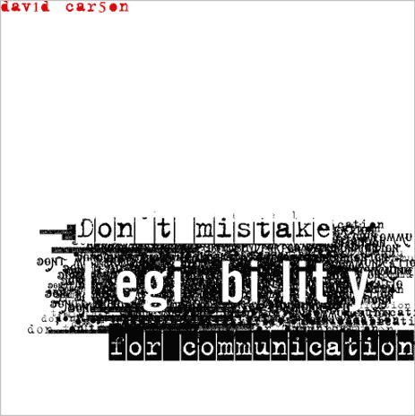
Principle 1- Draw by hand. 

‘Think on the page’ – Da Vinci

An important part of my R.V.J is how ideas are communicated. Drawing onto the page engages the thoughts from your head and forms the physical connection between mind, eye and hand.

Drawing onto the page is almost thinking out loud, getting them out of your head onto paper creates a dialogue and allows you to see what will work, how it connects, and helps you to realise your intentions.
It doesn’t matter if the images are pretty or not, they can be childish and crude, the most important thing is that you loose self consciousness and draw only for ideas, not art.

Image

Danny Gregory

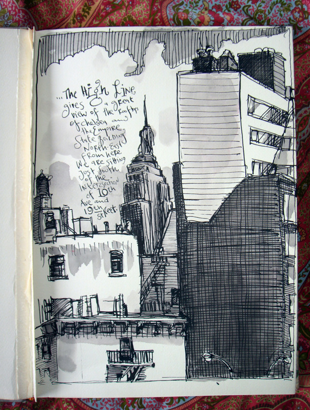
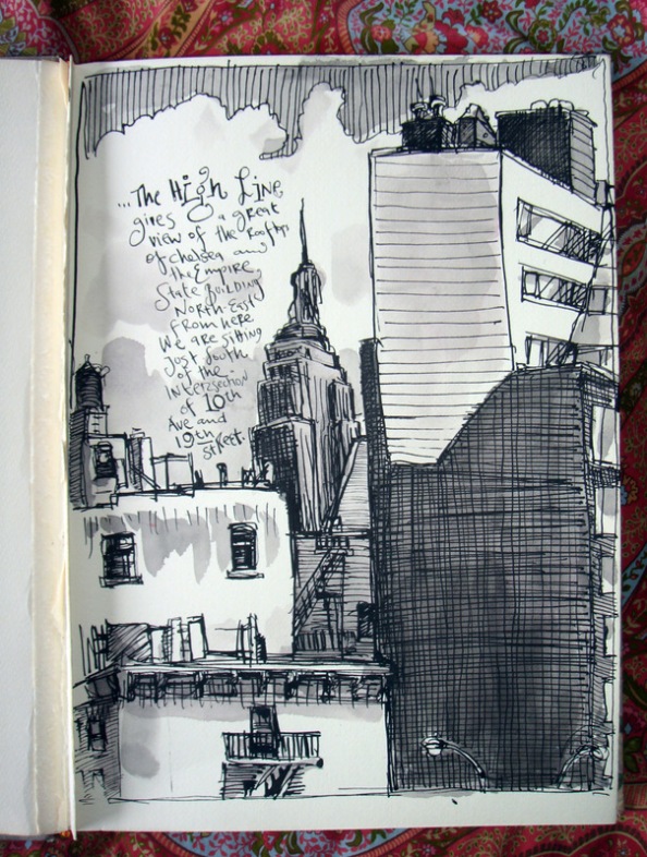
I looked at Gregory’s landscape journals, he explores skylines, architecture and building through sketches, using dip pens and only shading certain areas which brings the eyes attention to them and creates light and shade to define the image.

He has also made brief notes which help reflect on the time and moment and self feelings of the drawing which couldn’t be spoken as well through images.

Image

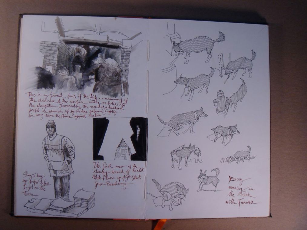
Gregory’s earlier journals, here you can see how he is exploring the dogs shape and form, as well as other quick sketches and ideas, with minimal writing.

Explore different mark making and textures, look around you and see everything as a material and apply this- use things you’ve never used before. Draw with sticks, cardboard, experiment!

let things go wrong!

Only from mistakes can you learn, and change and grow, accidents can develop into something that works.

another way drawing out helps is visualising films and animations through storyboard. Drawing is the language that brings the script to life before being adapted to camera.

Principle 2

Utilise your creative brain!

The brain is made up of 2 halves- the left hemisphere and right hemisphere. The right acts and thinks more like a child in that it is more creative and wants to play and explore. It is sensitive, childlike, innocent, and curious.

This means that the right side of the brain is engaged when drawing on the page and experimenting with new ideas!

For example in this drawing page my Henry Moore shows his creative right side of his brain as he pushes the pencil around in different mark making to create his sculpture.

The left hemisphere is more like an accountant as it has more analytical, thinking and grids.
Analysis <——> Experiment

One needs to feed of the other, through knowing which side of your brain you are using you can engage this more. One side is spontaneity then the other focus. You can draw and create then switch to your left of your brain to briery annotate, connect your ideas and reflect over what you have done.