
Principle 1- Legibility
leg·i·bil·i·ty noun
1. Also, leg·i·ble·ness. the state or quality of being legible.2.Also called visibility. Typography . the quality of type thataffects the perceptibility of a word, line, or paragraph ofprinted matter. Compare readability ( def. 2 ) .
Some factors that can effect legibility are- font, size, character shapes, serifs, weight, lining.
Type size needs to be appropriate to be legible, so where the text will be shown is important.
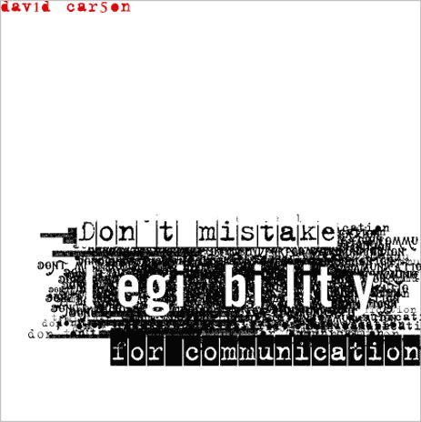
David Carson pushes the boundaries on legibility with his typography, his widely imitated aesthetic defined the so-called “grunge typography” era. He over laps text and builds it up to create different tones and surfaces. He famously made the text in the Ray Gun magazine unreadable.
It is normally of most importance that text for magazines, newspaper & print is legible to the audience so that they can read the articles, however Carson pushed this to the extreme.
I personally really like Carson’s typography as even though it is illegible it creates textures and images in the way it has been put together. I have taken this idea and put it into our magazine as it fits into the style of out magazine.
Tone of Voice- Principle 2
The tone of voice effects how the audience respond, understand and interact with your text/image.
Tone of voice can be the way something is written, or how it is written. For example something in capitals and bold is seen as a bold statement, normally of importance such as on STOP signs or as the heading of a newspaper.

Things handwritten are often used for a younger audience, such as in Kerri Smith’s books it adds quirky edge to the text. It also feels welcoming and personal to the reader rather than the standard typography.
 This website has a very young, bubbly tone of voice as it is aimed at female children. The colours, text, grammar and style all tie together to give it a ‘pop’ young feel which appeals to young girls.